
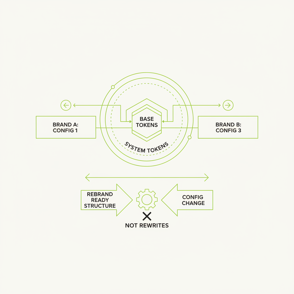
The digital landscape evolves at a relentless pace. Brands frequently refresh their identities to stay relevant, connect with new audiences, or reflect a shift in business strategy. For product teams, this often translates into a significant, time-consuming overhaul of user interfaces. However, with a strategic approach to design tokens, a brand refresh can be demoted from a monumental engineering task to a manageable configuration change.
Design tokens are the atomic units of a design system. They are named entities that store visual design attributes, such as colour, spacing, typography, and animation. More than just variables, tokens represent design decisions. Their power lies in abstracting these decisions from their implementation. When a brand changes, it is these design decisions that change, and tokens provide the mechanism to update them centrally and propagate those changes reliably across an entire product ecosystem.
The Challenge of Unstructured Tokens
Many teams adopt design tokens, but without a robust structure, their benefits for rebrands are severely limited. A common pitfall is to create tokens that are too tightly coupled to specific brand values or components. For instance, a token named `brand-primary-color` seems innocuous, but if the brand later adopts a completely different primary hue, this token name becomes misleading. Worse, if developers have directly used `blue-500` or similar colour names throughout the codebase, changing the brand's 'blue' to 'green' necessitates a search-and-replace nightmare, potentially missing instances and introducing inconsistencies.
The goal is to decouple the *purpose* of a token from its *value*. A token should describe *what* something is for, not *what* its current value is. This seemingly subtle distinction is paramount for future-proofing.
Layering: The Foundation of Rebrand-Proof Tokens
The most effective token structures employ a multi-layered approach, typically organised into global, alias (or semantic), and component-specific layers. This hierarchy allows for abstraction and controlled propagation of changes.
Layer 1: Global Tokens (The Raw Ingredients)
Global tokens are the lowest level, representing raw, unopinionated values. They are the 'primitives' of the system. Think of them as the base colours from your palette, fundamental spacing units, or font families before any application-specific decisions are made. They should be descriptive but not semantic in their naming. For example:
- Colour: `grey-100`, `blue-500`, `red-600`
- Spacing: `spacing-100`, `spacing-200` (e.g., 4px, 8px)
- Font Family: `font-family-sans`, `font-family-serif`
- Font Size: `font-size-xs`, `font-size-sm`
These tokens are intentionally devoid of brand context. A brand refresh might introduce new colours or adjust existing ones, but the underlying structure of 'a shade of blue' remains. The value of `blue-500` might change from `#007bff` to `#0a6bc2`, but its name remains stable.
Layer 2: Alias/Semantic Tokens (The Brand Application)
This is where the magic happens for rebrands. Alias or semantic tokens assign meaning and purpose to the global tokens. They define how the raw ingredients are used within the brand's context. Developers should primarily interact with these tokens, not the global ones.
Instead of `blue-500`, you would have `color-brand-primary` or `color-feedback-success`. These tokens then reference global tokens. For instance:
`color-brand-primary: { value: '{color.blue-500}' }` `color-feedback-success: { value: '{color.green-600}' }` `spacing-stack-sm: { value: '{spacing.spacing-200}' }` `font-heading-h1: { value: '{font.family-sans}', '{font.size-xxl}', '{font.weight-bold}' }`
When a brand refreshes, the global tokens might get new values (e.g., `blue-500` becomes a slightly different blue). More importantly, if the brand's primary colour shifts entirely, you simply update `color-brand-primary` to point to a different global token, such as `{color.purple-500}`. Every element using `color-brand-primary` instantly updates. This is the 'config change' aspect.
This layer also handles light/dark mode variations gracefully. Instead of changing every colour token, you define `color-background-default-light` and `color-background-default-dark`, each pointing to appropriate global tokens for their respective themes.
Layer 3: Component Tokens (Where Specificity Lives)
While semantic tokens are powerful, some design systems also benefit from a component-specific layer. These tokens override or refine semantic tokens for particular components when absolutely necessary, often to handle edge cases or unique component states.
For example:
- `button-primary-background-color: { value: '{color.brand-primary}' }`
- `button-primary-text-color: { value: '{color.neutral-white}' }`
- `card-border-radius: { value: '{size.border-radius-md}' }`
The key here is that component tokens still reference semantic tokens, not global ones directly. This maintains the chain of abstraction. If `color-brand-primary` changes, the button's background updates automatically. This layer should be used judiciously, as overuse can reintroduce complexity.
Implementation Considerations
To truly make a rebrand a config change, the tooling around your design tokens is as important as their structure. Utilise a dedicated token management tool or a build process that compiles tokens into various formats (CSS variables, SCSS maps, JavaScript objects, etc.). This ensures consistency across different platforms and technologies.
Furthermore, documentation is critical. Clear naming conventions, explanations of each token's purpose, and examples of usage are essential for designers and developers to understand and correctly apply the tokens. A robust version control strategy for your token definitions will also allow for seamless rollbacks and tracking of changes.
Conclusion: Embrace Change with Structure
The true value of design tokens is unlocked when they are structured with foresight. By creating a layered system of global, semantic, and carefully applied component tokens, product teams can build resilience against inevitable brand evolution. A brand refresh, rather than being a dreaded UI rebuild, transforms into a strategic update where designers and developers collaborate on adjusting values within a well-defined system. This approach not only saves time and resources but also fosters a more consistent, adaptable, and ultimately, more successful digital product experience.
This is how we work at DesignCyclein. If your team is weighing a similar decision, DesignCyclein's design and engineering leads are happy to talk it through — reach out via the contact form below.