
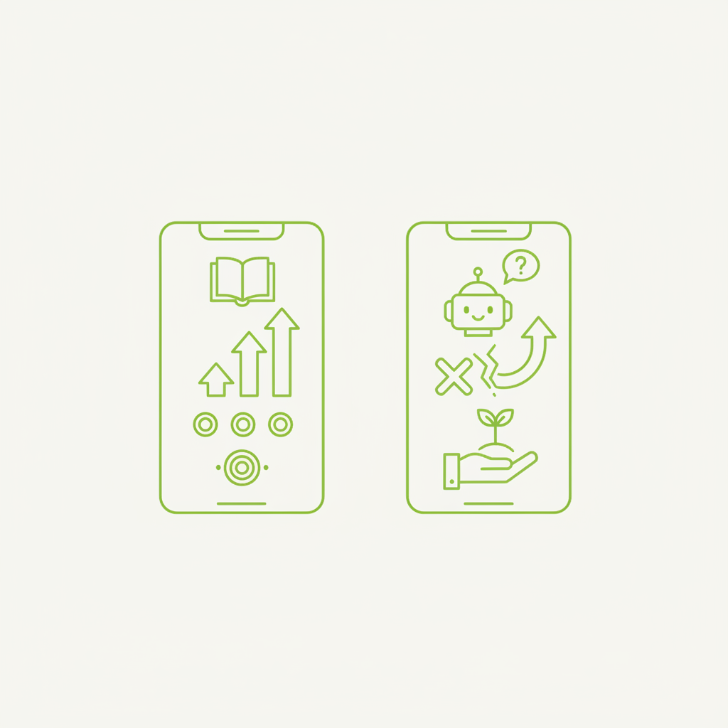
Every digital product begins its life with a clean slate. For most users, their initial encounter with your application involves a distinct lack of personal data. This 'empty state' – a screen devoid of content because the user hasn't created any yet – is often treated as an afterthought. It's an apology, a placeholder, a gentle nudge to get started. But what if we reframed this moment? What if, instead of merely acknowledging the absence of data, these zero-data screens became powerful, proactive onboarding tools?
At our studio, we advocate for an approach where empty states are designed not to apologise for a lack of content, but to educate, guide, and onboard. This isn't just about aesthetics; it's about leveraging a critical touchpoint to reduce friction, demonstrate value, and set users up for success from the very first interaction.
The Overlooked Opportunity of the Blank Canvas
Think of a new user opening your application for the first time. They’ve gone through the sign-up process, perhaps a brief walkthrough, and now they’re faced with a core feature screen. If it’s empty, their natural instinct might be confusion or inertia. A generic 'No items yet' message followed by a prominent 'Add new item' button is a functional solution, but it’s a missed opportunity for true engagement.
These initial moments are crucial for shaping a user's perception of your product. An effective empty state can:
- Illustrate the product’s core value proposition.
- Teach users how to perform the most important first actions.
- Reduce perceived complexity by breaking down initial tasks.
- Provide context for why a feature exists and what it achieves.
- Set an encouraging and welcoming tone.
- Prevent immediate abandonment due to uncertainty.
The goal is to transform what could be a moment of doubt into a moment of empowerment. It’s about building confidence and demonstrating utility before the user has even invested their own data or effort.
Strategic Principles for Teaching Empty States
Moving beyond a mere call-to-action requires a strategic mindset. Here are the principles that guide our design process for empty states:
1. **Contextual Clarity:** Don't just say 'Empty.' Explain *why* it's empty and *what* belongs there. For a task management app, an empty task list isn't just empty; it's waiting for 'your next great idea,' 'project milestones,' or 'daily priorities.' This immediately connects the user's need to the product's solution.
2. **Guided First Steps:** Your primary call-to-action should be obvious, but it should also be supported by brief, instructional text or visual cues. Instead of just 'Create,' consider 'Create your first project to organise your team's workflow.' Use arrows, highlights, or short animated examples to show *where* to click and *what to expect*.
3. **Demonstrate Value, Not Just Function:** Show, don't just tell, the benefit of filling the empty state. If it's a dashboard, illustrate with a faded overlay or ghost data what a populated dashboard *could* look like, and then explain the insights it provides. This motivates the user by previewing the 'reward' of their engagement.
4. **Offer Curated Examples (Where Appropriate):** For complex features, an empty state can include pre-filled, editable examples. A project management tool might offer a 'Sample Project' with dummy tasks. This allows users to explore functionality without the pressure of creating something from scratch, offering a safe sandbox for learning.
5. **Personalisation and Tone:** Maintain your product's voice and brand. An empty state can be friendly, professional, playful, or direct, but it should always feel consistent. If your product aims to simplify complex tasks, ensure the empty state reflects that simplicity in its messaging and visual design.
6. **Address Potential Roadblocks:** Anticipate common user questions or hesitations. If a feature requires integration with another service, the empty state is an ideal place to briefly explain this, or provide a link to the settings where the connection can be made.
Practical Implementation: A Design Workflow
Integrating these principles requires a structured approach from your design and product teams. Here’s a workflow we recommend:
1. **Identify Critical Empty States:** Map out all primary screens and features that will initially present as empty. Prioritise those essential for core user journeys and value delivery.
2. **Define User Goals & Product Value:** For each empty state, articulate the user's primary goal for being on that screen and the unique value your product offers in fulfilling that goal. This will inform your messaging.
3. **Brainstorm Educational Content:** What does the user *need to know* to proceed successfully? What common questions will they have? How can you show them the 'light at the end of the tunnel' (i.e., the value they will gain)?
4. **Sketch and Prototype:** Explore various visual and textual approaches. Don't be afraid to experiment with illustrations, micro-animations, or different layouts. Test different levels of instruction and calls-to-action.
5. **Craft Concise Copy:** Empty states thrive on brevity. Every word must count. Focus on clear, actionable language that guides without overwhelming. Avoid jargon.
6. **Integrate and Test:** Ensure the empty state seamlessly transitions once content is added. Conduct usability testing with new users to gauge clarity and effectiveness. Observe where users hesitate or get confused.
An empty state is not a failure; it's a conversation starter. It's your product's first opportunity to speak directly to the user's aspirations and guide them towards fulfilling them.
Beyond the First Interaction
It’s important to acknowledge that not all empty states are onboarding experiences. Some occur when a user has filtered data to zero results, deleted all items, or encountered an error. These require a different approach – one focused on clarity, problem-solving, and providing next steps. However, the core principle remains: these moments should still be helpful, not merely descriptive.
For instance, a zero-results filter should explain *why* there are no results and offer clear options to *adjust the filter* or *reset the view*. An 'all items deleted' state could offer a clear 'restore' option or guide the user to create new content, perhaps linking to relevant templates.
Conclusion: Invest in the Absence
The design of empty states is a small but significant detail that collectively shapes the user experience. By investing thought and effort into these initially blank canvases, product teams can transform potential points of friction into powerful opportunities for education, engagement, and ultimately, user retention. Shift your mindset from an apology for absence to an invitation for interaction. Your users, and your product’s success, will benefit from it.
This is how we work at DesignCyclein. If your team is weighing a similar decision, DesignCyclein's design and engineering leads are happy to talk it through — reach out via the contact form below.