
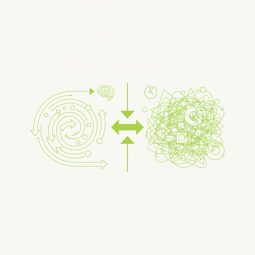
In the fast-evolving landscape of digital product design, motion has transcended its initial role as mere aesthetic embellishment. Increasingly, it is recognised as a fundamental component of effective user experience (UX). However, like any powerful tool, its misuse can degrade the very experience it aims to improve. This article delves into the strategic application of motion, exploring how thoughtful animation can enhance comprehension and guide users, whilst cautioning against its gratuitous deployment, which often leads to frustration and delay.
The distinction between motion that serves a purpose and motion that simply exists is critical. Purposeful animation aids understanding, directs attention, provides feedback, and establishes a sense of continuity. Conversely, animation implemented without clear intent can feel arbitrary, slow down interactions, and create cognitive load, ultimately detracting from usability. For design and software studios committed to delivering exceptional products, a nuanced understanding of this distinction is paramount.
The Foundations of Purposeful Motion
At its core, purposeful motion is about communication. It speaks to the user in a visual language, providing context and clarity where static elements might fail. Consider the principles that underpin effective animation in UX:
- **Clarity and Guidance:** Motion can highlight important elements, draw attention to changes, and guide the user's eye through complex interfaces or processes. For instance, a subtle animation upon a new notification appearing clearly communicates its presence without requiring a user to actively scan the screen.
- **Feedback and Responsiveness:** Immediate visual feedback following a user action (e.g., a button press, form submission) confirms that the system has registered the input. This reduces uncertainty and builds trust. Loading spinners, while often reviled, are a prime example of essential feedback, managing expectations during wait times.
- **Context and Spatial Relationships:** Animations can explain how elements relate to each other in space and time. Opening a modal or expanding a navigation menu with an animation reveals its origin and destination, maintaining a mental model of the interface's structure. This 'object permanence' in digital interfaces is crucial for intuitive navigation.
- **Hierarchy and Emphasis:** By varying speed, easing, and duration, motion can establish visual hierarchy. Faster, snappier animations might indicate primary actions, whilst slower, more deliberate movements could be reserved for critical system changes or confirmations, ensuring appropriate emphasis.
- **Delight (with restraint):** While not its primary purpose, well-executed, subtle motion can add a layer of polish and charm to an interface, fostering a positive emotional connection with the product. However, this should always be a secondary consideration to functional utility.
When motion is designed with these principles in mind, it ceases to be an aesthetic 'nice-to-have' and becomes an integral, functional part of the user interface. It enriches the interaction, making it more intuitive and less ambiguous.
When Animation Aids Comprehension
Specific scenarios demonstrate animation's power to enhance understanding and usability:
One of the most effective uses of motion is in explaining state changes. When a UI element transitions from one state to another (e.g., a button changing to a 'loading' state, or a filter panel sliding into view), animation can smooth this transition. Without it, the change can appear abrupt, causing users to question what just happened or where the new element originated. A smooth, directional animation clarifies the causality and spatial relationship, reinforcing the user's mental model of the interface.
Similarly, onboarding flows greatly benefit from thoughtful animation. Instead of bombarding users with static text, subtle animations can demonstrate how to interact with key features, guiding them through initial setup with engaging visual cues. For example, a quick animation showing a 'drag-and-drop' action can communicate functionality far more effectively than descriptive text alone. This reduces the cognitive load associated with learning a new interface, making the onboarding process feel less like a chore and more like an intuitive journey.
Good animation is like a helpful, invisible hand guiding you through the experience. Bad animation is a noisy, attention-seeking obstruction.
Data visualisation is another prime candidate for animation. Changes over time in graphs or charts can be powerfully conveyed through animated transitions, allowing users to perceive trends and shifts more clearly than by flicking through static representations. For instance, animating a bar chart to show growth over quarters provides a clearer narrative than simply presenting two static charts side-by-side.
When Animation Becomes a Detriment
The line between helpful and harmful animation is often crossed when motion is applied without a clear objective. Overuse of animation can quickly transform a fluid experience into a sluggish, frustrating one. One of the most common pitfalls is unnecessary delays. Every animation introduces a temporal element, and if that duration is not justified by a clear communicative purpose, it simply slows down the user. Long, drawn-out transitions for minor interactions, or excessive animation on frequently accessed elements, will undoubtedly test user patience.
Cognitive overload is another significant risk. An interface brimming with constant movement can distract users from their primary tasks. Imagine a dashboard where every widget animates its data points upon load, or where menus bounce and jiggle upon hovering. This cacophony of motion creates visual noise, making it difficult for the user to focus on what matters. Such interfaces often appear 'busy' and unprofessional, reflecting a lack of design maturity.
Inconsistency also undermines the utility of motion. If an animation is used to signify one type of action in one part of the application, but a different or arbitrary action elsewhere, it creates confusion. Users learn to associate certain movements with certain outcomes; breaking these learned associations erodes predictability and intuitiveness.
Practical Guidance for Product Teams
To ensure motion enhances rather than hinders, product teams should adopt a systematic approach:
1. **Define the Purpose:** Before implementing any animation, ask: 'What message does this motion convey? How does it help the user?' If the answer isn't clear, reconsider. Motion should be a tool for communication, not decoration. Document the intended purpose of each significant animation within your design system.
2. **Prioritise Speed and Efficiency:** Default to brevity. Most UI animations should be swift – typically between 200-400ms for common interactions. Longer durations should be reserved for more significant state changes or aesthetic flourishes that genuinely add to the experience without impeding flow. Always consider perceived performance; a quicker animation often feels more responsive, even if the underlying process takes the same amount of time.
3. **Test with Real Users:** Subject your animated prototypes to user testing. Observe where users get confused, impatient, or distracted. A/B test different animation durations or styles to see which performs better in terms of task completion and user satisfaction. What designers perceive as delightful, users might find irritating.
4. **Offer Control and Accessibility:** Provide options for users who may be sensitive to motion or prefer a snappier experience. A 'reduce motion' setting, often found in operating system accessibility settings, should be respected by your application. This not only enhances accessibility but also caters to diverse user preferences and technical capabilities.
5. **Maintain Consistency:** Establish a clear set of motion guidelines as part of your design system. Define standard easing curves, durations, and trigger events for different types of interactions. This ensures a predictable and cohesive experience across your product suite.
Conclusion: The Art of Subtlety
Ultimately, the effective use of motion in digital products is an exercise in subtlety and restraint. It is about understanding that the most powerful animations are often those that go unnoticed, seamlessly guiding the user's journey without drawing undue attention to themselves. By treating motion as an integral functional component rather than a superficial flourish, design and software studios can craft products that are not only aesthetically pleasing but also profoundly intuitive, efficient, and user-centric.
Motion, when purposefully applied, can elevate a user experience from good to exceptional, making complex interactions feel effortless and abstract concepts tangible. However, the onus is on design teams to wield this tool with precision and respect for the user's time and cognitive bandwidth. The goal is to inform, delight, and guide – never to delay, distract, or disorient.