
The pricing page is often the most critical juncture in a product's journey towards user adoption. It is where value translates into cost, and where the promise of a solution meets the reality of a budget. Yet, many pricing pages inadvertently disrespect the very individuals they aim to convert. They are laden with jargon, obfuscated by design trends, or structured to trick rather than inform. At DesignCyclein, our philosophy asserts that a pricing page should be an exercise in transparency and respect, guiding the reader through an informed decision-making process rather than cornering them into one.
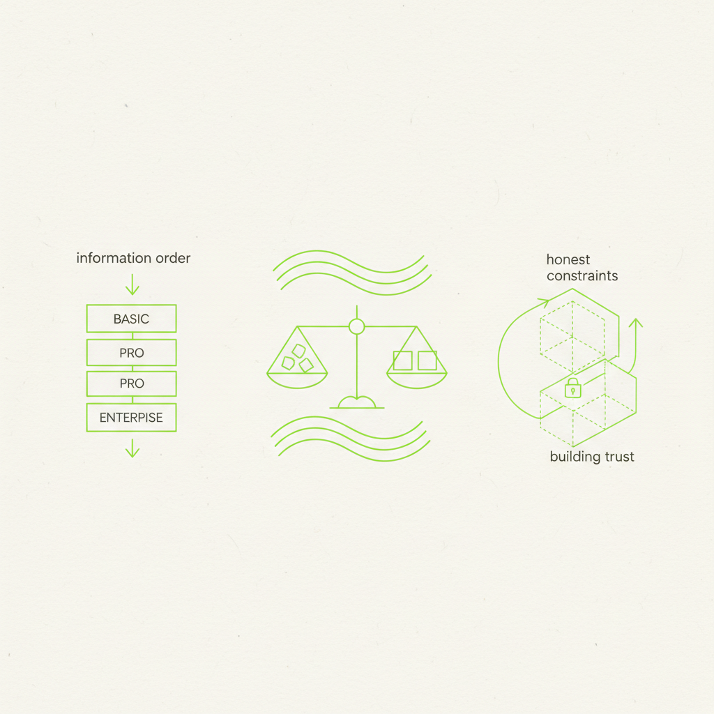
This article outlines a practical, opinionated approach to designing pricing pages that prioritise the reader. We will explore how strategic information order, clear comparative structures, and honest acknowledgement of constraints can elevate a pricing page from a necessary evil to a powerful conversion tool, building genuine trust along the way.
The Primacy of Information Order
The sequence in which information is presented on a pricing page is paramount. It dictates the narrative, framing the reader's understanding of value before they even encounter a price tag. Resist the urge to lead with the cheapest option or to highlight an 'enterprise' tier prematurely. Instead, build context.
- **Establish Core Value First:** Begin by reiterating the fundamental problem your product solves and its unique selling proposition. This primes the reader, reminding them *why* they are considering your solution before they deliberate *how much* it costs. A brief, compelling statement or a concise overview of core benefits can achieve this.
- **Introduce Plans Incrementally:** Present your plans in a logical progression of value. For many SaaS products, this means starting with the most popular or 'standard' offering, which often represents the sweet spot for the majority of users. This anchor establishes a baseline. Subsequent plans can then be introduced as enhancements or scaled-down versions of this core offering.
- **Feature Elaboration, Not Exhaustion:** Detail features relevant to each plan, but avoid feature dumps. Focus on how features translate into benefits. Use concise language and visual cues (icons, short bullet points). Readers are scanning, not studying a technical manual.
- **Price as the Culmination:** The price itself should appear after the reader has a firm grasp of what they are receiving. It is the logical conclusion to a value proposition, not its opening statement. Display it clearly, without hidden fees or obscure billing cycles.
Crafting Meaningful Comparisons
Comparison tables are a standard fixture, but their design often hinders rather than helps. A truly respectful comparison empowers the reader to discern the best fit for their needs, rather than nudging them towards the most profitable option for the business.
Focus on differentiating features and limits, not simply enumerating every single capability. Highlight the specific use cases or user types each plan is best suited for. For example, instead of just listing '5GB storage' vs. '50GB storage', explain who benefits from 5GB (e.g., 'Solo users, basic projects') and who requires 50GB ('Teams, extensive archives').
“The aim of a good pricing page is not to sell the most expensive plan, but to help the customer find the *right* plan for their needs. Trust is built on alignment, not upselling.”
Visual hierarchy is crucial. Use distinct colours or bolding for the 'recommended' or most popular plan, but ensure this does not obscure the details of other options. Keep the number of plans manageable; three to four is typically optimal. Too many choices lead to decision paralysis.
Consider the axis of comparison carefully. If your product is usage-based (e.g., API calls, storage), clearly delineate how these metrics scale across plans. If it is feature-based, group features logically and indicate availability with simple ticks or crosses, with tooltips for further explanation.
Honest Constraints and Transparent Limitations
No product can be everything to everyone, and no pricing plan is unlimited. Trying to hide or obscure limitations is a disservice to the user and a fast track to churn. A pricing page that respects the reader openly communicates what each plan *cannot* do, or where its limits lie.
This means clearly stating usage limits (e.g., 'Up to 10 users', '5,000 API requests/month', 'Standard support only'), rather than burying them in footnotes or terms and conditions. If certain advanced features are exclusive to higher tiers, explicitly call this out. This transparency manages expectations and prevents frustrating discoveries later on.
Furthermore, address common objections or uncertainties. A well-placed FAQ section on the pricing page can pre-empt questions about billing cycles, cancellation policies, data migration, or security. This demonstrates an understanding of the user's concerns and provides immediate reassurance, reducing the cognitive load required to make a decision.
Beyond the Price Tag: Building Trust
Respect on a pricing page extends beyond mere clarity; it encompasses trust. This is cultivated through consistency in messaging, absence of dark patterns, and a commitment to genuine assistance. Ensure that the language used reflects your brand's overall tone – professional and informative, not overly aggressive or salesy. Avoid countdown timers designed to create false urgency unless there is a legitimate, time-bound offer.
Provide clear calls to action (CTAs) for each plan, but also offer pathways for those who do not immediately fit into a predefined tier. A 'Contact Sales' button for enterprise inquiries, or a 'Custom Plan' option, acknowledges diverse needs without overwhelming the core offerings. A prominent link to a free trial or a demo sign-up is also crucial for reducing friction.
Implementation for Product Teams
For product teams looking to apply these principles, begin with a thorough audit of your existing pricing page. Ask yourselves:
- Is the information presented in a logical, benefit-first order?
- Are comparisons immediately clear and relevant to distinct user segments?
- Are all limitations and constraints transparently communicated?
- Does the page build trust or create confusion and suspicion?
- Can a user quickly identify the right plan for their specific needs without feeling manipulated?
Involve user research. Conduct user testing on your pricing page. Observe how users navigate the options, what questions they ask, and where they hesitate. Their feedback is invaluable in identifying points of friction and misunderstanding. A/B test different layouts, comparison methodologies, and phrasing. Iteration based on data is key.
Ultimately, a pricing page should reflect the same user-centric design principles applied to the product itself. It is a critical touchpoint where perceived value meets monetary cost. By focusing on intelligent information order, clear comparisons, and honest constraints, you do more than just sell your product; you foster a relationship built on transparency and mutual respect. This approach is fundamental to DesignCyclein's philosophy, and we believe it is the only sustainable path to long-term customer success.