
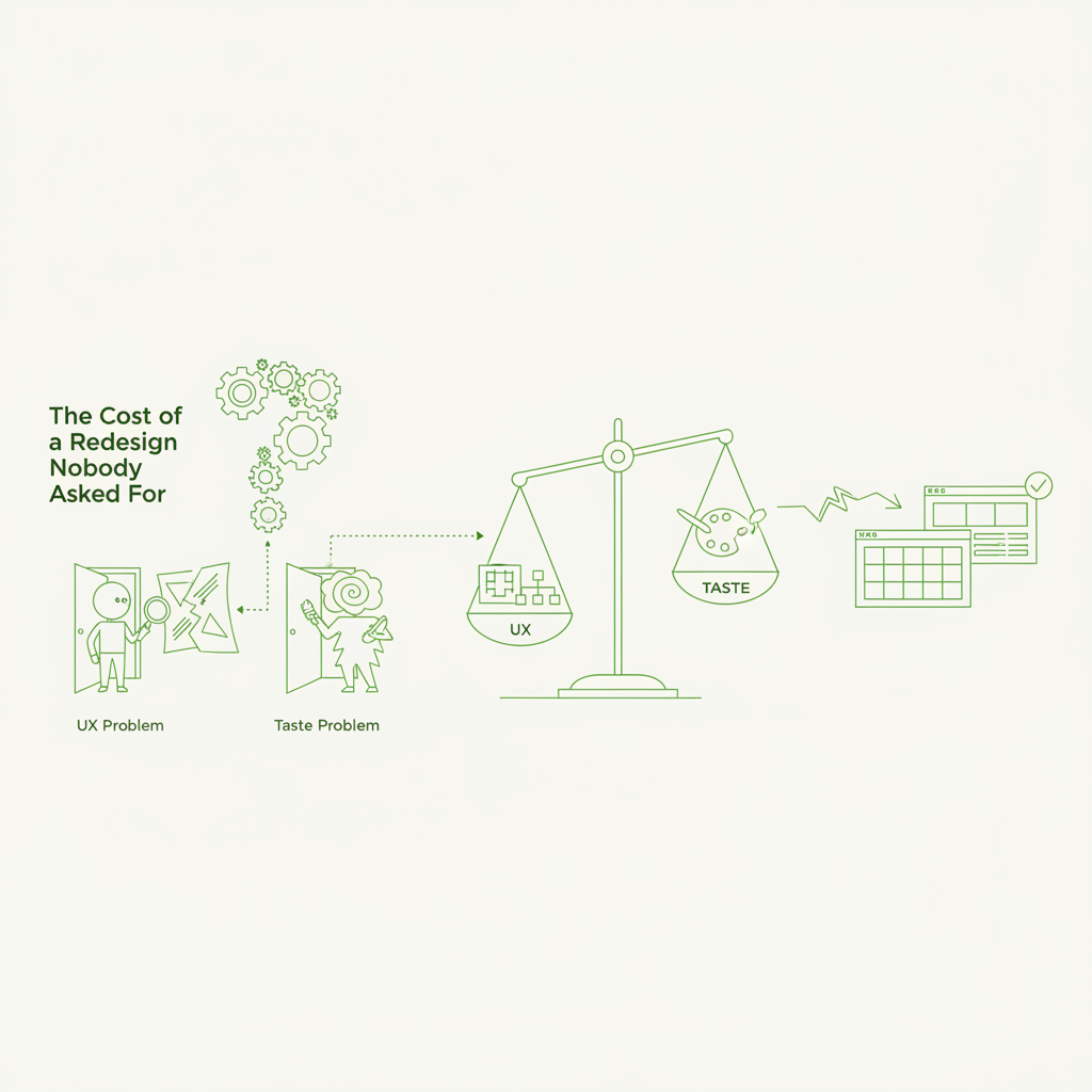
Every product reaches a point where someone, somewhere, suggests a redesign. Often, this suggestion is born from a sincere desire to improve. However, not all improvements are created equal, and a significant proportion of 'redesign' impulses stem from personal taste rather than demonstrable user experience (UX) friction. Embarking on a full-scale redesign based on a preference, rather than a proven problem, is a costly endeavour in terms of resources, time, and potentially, user goodwill.
Distinguishing between a genuine UX problem and a matter of subjective taste is perhaps one of the most critical skills a product team can cultivate. Failing to do so can lead to wasted effort, delayed feature development, and a product that constantly shifts without clear, data-driven direction. This article provides practical guidance for identifying the difference and ensuring that redesigns are always purposeful.
The Allure of the 'Fresh Look'
There is an undeniable human inclination towards novelty. A 'fresh look' can feel invigorating, suggesting progress and modernity. For internal stakeholders, a redesign can signal innovation or a response to competitor trends. But this allure can be deceptive. A product's interface, like a comfortable pair of shoes, gains value through familiarity and utility. Disrupting this familiarity without a compelling, user-centric reason can be detrimental.
Consider the internal stakeholder who declares the current interface 'outdated' or 'boring'. These are powerful subjective adjectives. While they may hint at underlying issues (e.g., poor information hierarchy making navigation tedious, or a colour palette that fails accessibility standards), often they are simply expressions of personal aesthetic preference. A CEO, a sales lead, or even a new designer might bring their personal design philosophy to the table, advocating for changes that align with their taste rather than with observed user behaviour or strategic objectives.
Identifying True UX Problems: The Data-Driven Approach
A genuine UX problem manifests as measurable friction in the user's journey. It affects task completion, comprehension, efficiency, or overall satisfaction in a quantifiable way. Here’s how to identify them:
- Analytics Data: Look for sharp drop-offs at specific points in a user flow, unusually high bounce rates on key pages, or prolonged task completion times. High error rates in form submissions or repeated clicks on non-interactive elements are also strong indicators.
- User Testing & Observational Studies: Directly observe users interacting with the product. Do they hesitate? Express confusion? Fail to complete tasks? Struggle to find critical information or functionality? Pay attention to verbal and non-verbal cues.
- Support Tickets & Customer Feedback: Analyse support queries for recurring themes. Are users frequently asking how to perform a specific action? Reporting difficulties with particular features? Expressing frustration about the interface? Look for patterns in feedback across multiple channels.
- Heatmaps & Session Recordings: Visualise user interactions. Are users missing important calls to action? Clicking on dead space? Scrolling past vital content? Session recordings can provide invaluable context to quantitative data.
- A/B Testing Results: If previous small-scale tests have shown significant positive or negative impact on key metrics, this indicates an area ripe for further investigation, whether it's a 'problem' or an 'opportunity' for improvement.
- Accessibility Audits: Objective assessments against recognised accessibility standards (e.g., WCAG) can reveal critical failures that exclude segments of your user base. These are not taste-driven; they are compliance and usability imperatives.
If a user can't find it, it doesn't exist. If they can't use it, it's broken. These are not matters of opinion; they are matters of fact rooted in interaction.
Distinguishing Taste from Trouble
Subjective preferences, while valid to the individual, are not typically universal and rarely correlate directly with measurable user struggle. How do you spot them?
Consider the language used. 'It's ugly,' 'I don't like the colour,' 'It feels dated,' 'Can we make it more modern?' These are personal opinions. While a collective sentiment of 'ugliness' might point to an underlying issue (e.g., poor visual hierarchy leading to cognitive overload), the initial statement itself is subjective. The key is to challenge these statements and probe for the underlying reasoning. Ask 'Why does it feel dated?' or 'What specific difficulty does the current colour scheme present?'
A good test is to remove the 'user' from the equation. If the proposed change primarily addresses an internal stakeholder's aesthetic preference without a clear link to external user behaviour or a business metric, it's likely a taste issue. If the change is proposed because a competitor has a 'nicer' interface, question whether that competitor's interface demonstrably performs better for its user base on key metrics, or if it simply aligns more with current design trends.
Communicating and Prioritising Based on Evidence
Once you can confidently distinguish between UX problems and taste preferences, the next step is effective communication and prioritisation. When a stakeholder proposes a change based on taste, rather than dismissing it outright, acknowledge their perspective and pivot the conversation towards user-centric evidence.
For instance, if someone suggests changing a button colour because 'it clashes,' respond with, 'That's an interesting point about the aesthetic. Our analytics show that users are successfully clicking this button at a rate of X% with Y completion time. Do we have any user feedback or data suggesting that the current colour impacts their ability to complete the action or their overall satisfaction?' This reframes the discussion from subjective opinion to objective performance.
Prioritise genuine UX problems based on their impact and frequency. A problem affecting a critical path for a majority of users should always take precedence over an aesthetic tweak. Create a 'problem backlog' rather than a 'feature backlog' and ensure each item in it is tied to demonstrable user friction.
The 'Small Bet' Approach to Aesthetic Evolution
This isn't to say that aesthetic improvements are entirely without merit. Design language evolves, and products can indeed start to look visually dated. However, major overhauls driven purely by aesthetics are rarely justified. Instead, adopt a 'small bet' approach.
Implement minor, iterative visual refinements that can be A/B tested. Can a subtle adjustment to spacing improve readability without disrupting established mental models? Can a refined icon set enhance clarity without requiring relearning? These are small, reversible changes that minimise risk and allow for data collection. If these small changes demonstrably improve a specific metric (e.g., reduced cognitive load, faster comprehension, increased engagement), then they evolve from a 'taste' suggestion into a data-backed improvement.
A truly user-centric product evolves its aesthetic subtly, in response to genuine needs and modern interaction patterns, rather than through sweeping, unvalidated overhauls. This approach respects user familiarity, conserves resources, and focuses on delivering tangible value.
Conclusion: Invest in Problems, Not Preferences
The cost of a redesign nobody asked for extends far beyond development hours. It encompasses the opportunity cost of not addressing real user pain points, the potential erosion of user trust due to unnecessary change, and the fatigue it can induce within the product team. By cultivating a culture that prioritises rigorous problem identification through data and user research, product teams can avoid these pitfalls.
The objective is not to resist all change, but to ensure that every significant design investment is a strategic response to a proven problem, not merely an aesthetic whim. Focus resources on where they will yield the greatest return: solving genuine user friction and enhancing core functionality. This disciplined approach leads to more stable, effective, and ultimately, more successful products.